Exploring Some Big Design Changes for Sofa
After two months of grinding on a ton of infrastructure work to enable Smart Lists, this was the first week I was able to dive back into the fun stuff.
After two months of grinding on a ton of infrastructure work to enable “Smart Lists”, this was the first week I was able to dive back into the fun stuff.
The way “Smart Lists” work is forcing me to rethink some parts of the UI which then ended up raising some bigger design questions.
This new direction is feeling pretty fresh, and fun. That being said, this is still very exploratory and a work in progress. Things likely will change.
Smart Lists
Smart Lists are now fully working. You’ll be able to create filters based on your own Ingredients and some “system” properties. Any and all of these can be combined to create really powerful ways to filter all the stuff you have in Sofa.
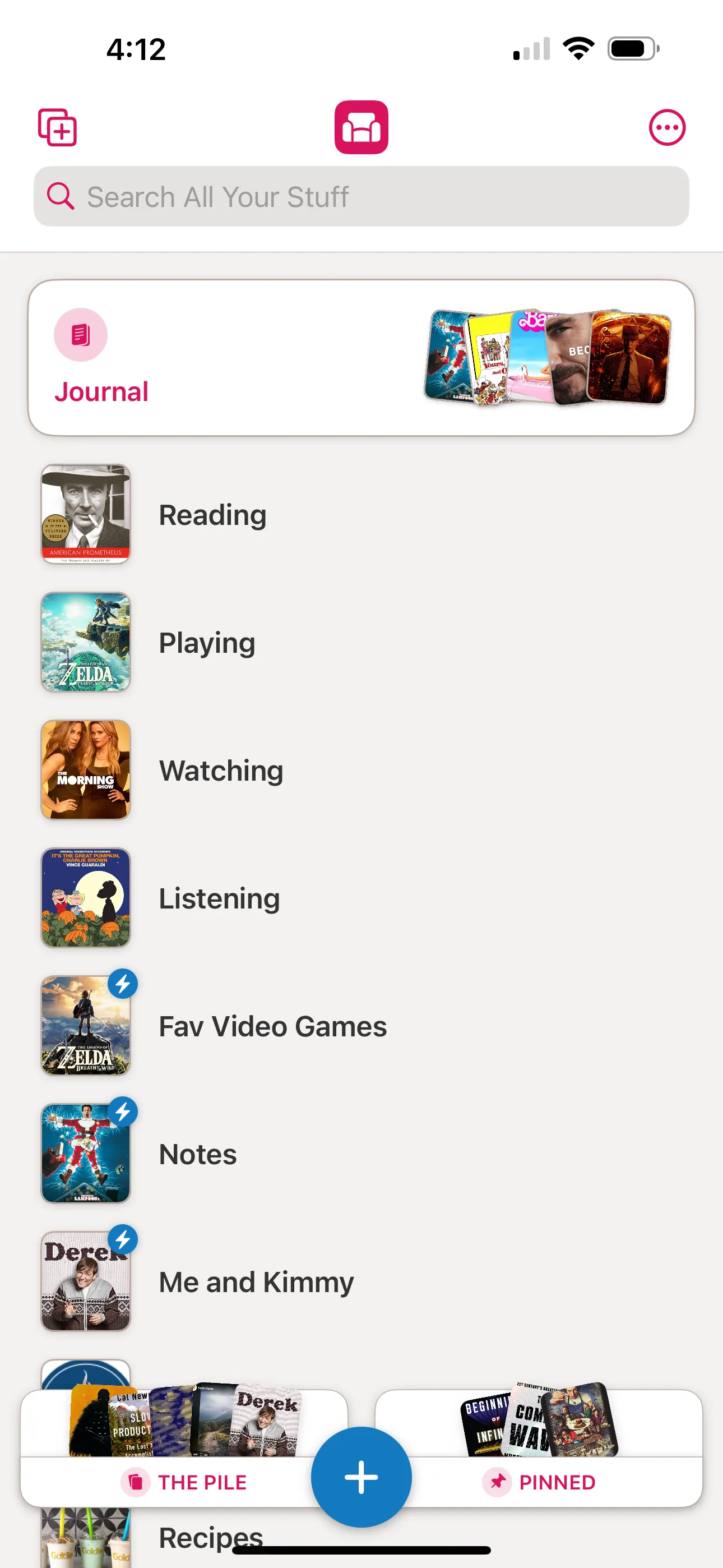
Smart Lists will have a little lightning bolt icon attached to them.
Pinned Lists
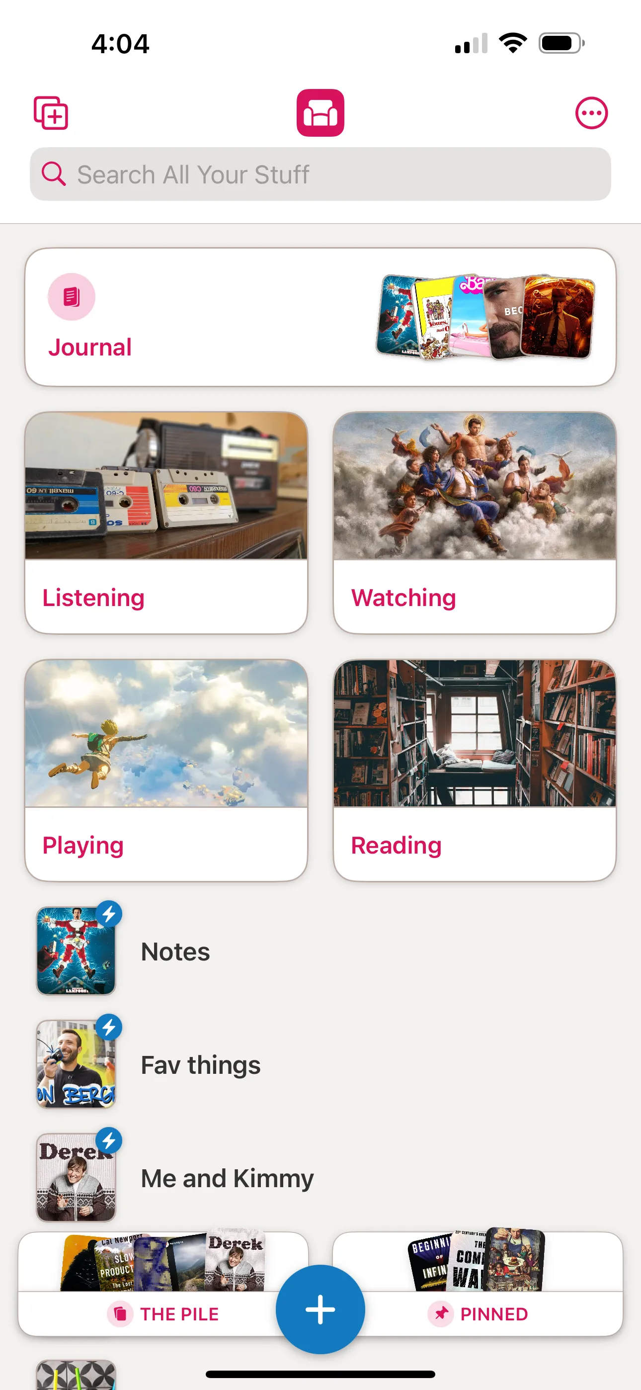
If you’re someone who has a decent number of groups and lists, sometimes it can be a bit of a slog to scroll to a list you use frequently. Well, now you’ll be able to pin any list and it will stay at the top of all your lists for quick access.
Pinned lists also come with a nice card design that displays a larger cover image.
New Home Screen Design
I’ve had the current design for Sofa since the summer of 2021, when version 3.0 was released. Since then, I’ve learned a lot about what works, what causes people to get a little tripped up, and what’s annoying.

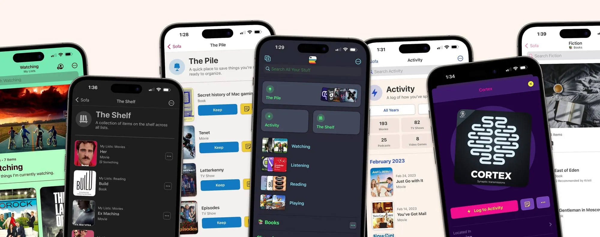
One of the main bits of feedback I’ve gotten is wanting to disable some of the default lists like “The Pile” or “The Shelf”. While these are handy tools, not everyone wants or needs them. They are taking up valuable space regardless of what you want.
The other bit of feedback is confusion around how to use certain features. I think this has mostly been due to how I’m named things. For example, “The Shelf” confuses a lot of people. I end up explaining it by saying “it’s like pinning something”…which means I should probably just called it “Pinned”.
So, this design gives a lot more control, removes things if you don’t need them, and (hopefully) clarifies the naming of features.
What’s Next
I’m currently working on getting all of this polished enough to share with beta testers. After that I still have a bunch of work to do to finish this release.
I’ve been calling this release 3.5, but now I’m starting to wonder if it’s more of a 4.0 🤔.
Anyways, I’m open to any and all feedback 👋.


